When it comes to sharing or increasing access to data, there is a wide range of different approaches out there and finding the most suitable approach can be tricky
Jared Robert Keller shares why we created the Data Access Map to help people and organisations explore the various options and navigate this difficult terrain.
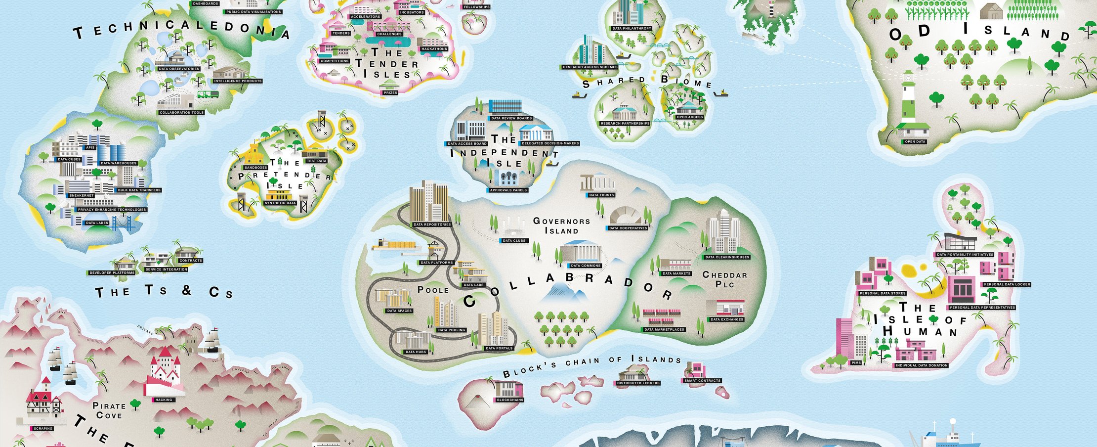
In the summer of 2019 we launched a polished version of the Data Access Map, an illustration designed to help people navigate the range of different ways of sharing and increasing access to data out there, and the variety of terms being used to describe them. Later that year we launched an interactive version of the map (hosted by Stroly) which includes ‘high-altitude descriptions’ of all the regions and landmasses contained on our map. The descriptions of the regions are meant to help convey our reasoning behind why certain approaches have been clustered into different regions and provide guidance to help people understand our particular approach to and way of talking about data access and data sharing .
This article sits alongside the interactive version and is meant to demonstrate how we at the ODI have been using the map as a narrative tool and as an explanatory tool.
The 'using the map as a narrative or storytelling tool' section below illustrates how we have been using the map as a narrative or storytelling tool to flesh out ODI messaging around data access, provide a useful visualisation of the Data Spectrum and help us demonstrate the wide range of work and research we as the ODI do across that spectrum from closed to shared to open - despite our name as the Open Data Institute.
The 'how to use the map to explain concepts related to data access' section below works through some examples of how to use the map in your own conversations and includes guidance around how to use the map as an explanatory tool to explain various concepts.
Introduction to the Data Access Map
Why we think the Data Access Map is useful
We believe the map is a useful framework for thinking about the world of data access and the range of ways that people and organisations share and increase access to data. At the ODI, we think about data, data sharing and data infrastructure a little differently, and this map has helped us tell stories about data and communicate our particular way of thinking about the world of data access.
A word of caution: it’s the journey not the destination
We see most data access arrangements as a collection of different approaches on the map - eg a data challenge that pools data into a data platform and uses a data review board to judge applications for access to that data. As such, the map metaphor being deployed here is about charting a journey across the map in order to collect the different individual approaches that help you put together a fit-for-purpose data access arrangement.
The journeys charted by various organisations will therefore differ based on their varying goals, contexts, industries, type of data being shared, etc. However, we have noticed some people using a metaphor of ‘relocation’ or ‘settlement’ - eg “my organisation currently keeps our data closed on the Forbidden Isle. We need to move to and settle on Technicaledonia in order to share more data.” When using the map it is important to understand our modular view of data access and stress the old cliche: ‘the important thing is the journey not the destination’
Using the map as a narrative or storytelling tool
There are many different ways to use the map to tell stories about data. The map can even be used to tell stories about your organisation’s work over the years or across the data spectrum. Below are just a few examples of the different ways we have used the map as a storytelling tool.
The story of the ODI, who we are and what we do
- Back in 2012 when we were first founded by Sir Tim Berners-Lee and Sir Nigel Shadbolt, we focused on open data and therefore naturally spent much of our time exploring things found on OD Island - eg ‘Open Data’, ‘Open Access’, ‘Open Standards’. Since then, the open data movement has become much more robust and gained in momentum and we have shifted our attention to the large, middle section of the map. In terms of the ODI Data Spectrum, this is the ‘shared’ section of the map…
- So even though we’re the Open Data Institute, we do a lot of work in the shared space. For example, in the last few years we have researched or worked on projects focusing on:
- ‘Incubators’ on the Tender Isles (Data Pitch)
- ‘Synthetic Data’ on the Pretender Isles (P8 Anonymisation and Re-identification)
- ‘Data Trusts’ on Governors Island (P7 Increasing access to data while retaining trust)
- ‘Data Observatories’ on Technicaledonia (P4 Peer to peer accommodation)
- ‘Blockchains’ and ‘Smart Contracts’ on Block’s Chain of Islands (P5 Emerging Data Technologies)
- We also recognise that there are valid reasons why an organisation would choose to keep data it holds closed - eg for proprietary, privacy or national security reasons. We have included the Forbidden Isle in reference to this. (To learn more about the Forbidden Isle, see this section below.
- Working from bottom left to top right, the map functions as a detailed illustration of the Data Spectrum. There is closed data on the Forbidden Isle in the bottom left corner, shared data in the middle and open data on OD Island in the top right corner.
The world of data access is too complex and messy to fit into a spectrum, schema or matrix.
- At the ODI we believe the real world of data access is often messy and that some things are complex and difficult - and probably shouldn’t be too simple or easy. While it might be possible to distill the world of data access into a chart or taxonomy, we might question whether that type of guidance will ultimately be very useful for organisations exploring their options for increasing access to data. In part because the ‘models of data access’ that people talk about often overlap with other models or are set up in very different ways depending on the context, use case, sector etc.
- So instead of trying to hide the complexity of the real world we have tried to use the map to highlight that complexity by clustering different approaches into ‘regions’ on a map. Ultimately we are trying to find the right balance between accessibility and utility - between simplicity and nuance. On one hand, we want to be able to offer advice to people and organisations about which approaches might best suit their needs. On the other, we want to be clear that whichever approach they choose, they will still need to do a lot of work to make that approach work in their specific circumstances, context, use case etc.
Which leads to another point about the world of data access...
There are no silver bullets or one-size-fits-all approaches to data access
- Although there are dozens of different approaches listed on the Data Access Map, there no end-to-end solutions that will immediately solve all the issues or difficulties of stewarding data or increasing access to data.
- For instance, even if an organisation decided that they wanted to pursue technical infrastructure like a data lab or data platform (found on Poole), they would still need to make decisions related to things like governance, data management, oversight, auditing, incentives, privacy, ethics or public and stakeholder engagement.
Which leads to another point about the world of data access...
Real-world access arrangements are often an amalgam of different approaches on the Data Access Map (some might call this a modular approach)
- Take a hypothetical, though not entirely implausible, example:
- A tech company and a university might pool their data in a data warehouse (Technicaledonia) in order to put on a data challenge (the Tender Isles). Applicants might receive initial access to synthetic data (The Pretender Isles) made available via an API (Technicaledonia), after which applications would be assessed by a data review board (The Independent Isle) which would then provide access for selected participants to the full dataset via a data hub or data lab (Poole).”
- The point being that many ‘data access arrangements’ are collections of different approaches spread throughout the map, and can, in a sense, be combined in different ways depending on the ultimate goal of the data sharing arrangement and on things like the context, type of data being shared or regulatory/legal regime.
- A useful metaphor is Google’s (since aborted) attempt at manufacturing modular smartphones that would allow you to pick and choose between different cameras, processors, graphics cards, screens, hard drives, etc. depending on your preferences. Say you bought a phone for Christmas one year but by spring of the next year your circumstances or preferences had changed - just swap in a more powerful camera or processor.
Some ‘open’ data is not as open as it may seem
- See, ‘Fauxpen Data’ off the western coast of OD Island.
- As we write in the descriptions doc: “One of the more controversial areas of the Data Access Map, the approaches found on this craggy outcropping of land are not as open as they might hope or claim to be. People and organisations that find themselves here may have set out for OD Island in an effort to publish data openly but ran off course along the way. In some cases they may have simply misunderstood what is required for data to qualify as truly open, or may have fallen short of their aspiration to publish data in an open way. In other cases an organisation or group of organisations may have purposefully misrepresented their initiative or the data they are publishing in an attempt to cash in on the cachet of open data - a process known to some as ‘open washing’.
- The ODI believes it is worth protecting the term ‘open data’ from misuse or misapplication - whether it be intentional or unintentional. Otherwise, the term may become watered down, confused or lose its meaning. There are valid reasons why in some cases data should be kept closed (see: The Forbidden Isle) or shared only under specific circumstances with appropriate restrictions on use, just as there are valid reasons why some data should be made openly available. But it is important that data stewards, holders, reusers and subjects are able to agree on what makes a dataset open and understand when a dataset falls in the closed, shared or open part of the Data Spectrum.”
There are valid reasons to keep data closed… but some data that is currently kept closed could be made open or shared.
- See, ‘The Forbidden Isle’ in the southwestern corner of the Data Access Map.
- The large southwestern region known as the Forbidden Isle is unique in the Data Access Map, as it is the only region which is home to approaches that are aimed at limiting or preventing - as opposed to increasing - access to data beyond the current data holder. This is to safeguard data that we at the ODI describe as residing in the ‘closed’ part of the Data Spectrum. This data might be closed for commercial confidentiality, to protect people’s privacy or enhance national security.
- Most of the data that exists in the world is currently siloed within organisations but not all the data currently held on the Forbidden Isle is there for good reasons. The region houses some data that is currently being siloed within organisations unnecessarily - in some cases because siloing data has long been standard operating procedure, in other cases because organisations are unaware of the ways they can increase access to data safely, ethically and responsibly. Some of the data currently held within organisations could be moved to the ‘shared’ parts of the spectrum while other data could be published openly. In either case, increasing access to that data would enable it to be used in more situations, to address more problems and support more services, thereby unlocking more value from data.
- The Data Access Map is intended to help organisations explore and identify the approaches that could enable them to safely, ethically and responsibly increase access to the data they hold.
Many people and organisations are trying to develop approaches that can specifically steward data about people
- When it comes to the stewardship of data, business as usual is not working and sensitive, personal information is often not stewarded in trustworthy ways that ensures privacy. Recent years have seen an increasing emphasis on identifying and developing new, trustworthy ways of stewarding data about people.
- The Isle of Human is an indication of the widespread and wide-ranging nature of these attempts.
Many people and organisations are trying to develop ways of generating revenue from providing access to ‘personal data’
- The business model of major internet companies can seem to some to be built around selling data about people. That is not quite what they’re doing - they are selling ad space rather than data about people - but to many it can feel like something that should ‘belong to them’ is being sold. This leads some to wonder whether these companies are unfairly benefitting from the exploitation of data about us and to ask whether those benefits could be more fairly distributed. To address this, some people think individuals should own data about them to ensure they fairly benefit from it; others go as far as saying people should be paid when other organisations use data about them.
- Many of the approaches on Cheddar Plc. have this goal in mind as do some of the approaches on the Isle of Human.
Tech is not enough
- There are many different technologies for increasing access to data (see: Technicaledonia, The Pretender Isles, Poole and Block’s Chain of Islands, among others), but people and organisations who identify the right technology still have other decisions to make related to things like governance, data management, oversight, auditing, incentives, privacy, ethics or public and stakeholder engagement.
How to use the map to explain concepts related to data access
Far be it from us to tell you what stories to tell or how to tell them, but here are a few favourites that we’ve used at workshops, conferences, etc.
Using the map to describe what a data trust is and how it is similar/ different to other approaches on the map
What is a data trust? Will it help me pool data from different sources?
- While a data trust could be used to steward aggregated or pooled datasets, they need not be; a data trust could be used to steward and govern access to a single dataset contributed by a single data holder just as well as it could be to steward a dataset that combines data from multiple holders.
- That is why we have placed data trusts on Governors Island with all the other governance approaches rather than with the technical infrastructure for pooling data found next door on Poole.
- But we have placed the governance approaches near the technical infrastructure to show the close relationship between the two regions.
What is a data trust? Will it help me generate revenue from data I hold?
- While a data trust could be set up to generate revenue from data stewarded by the trust (and we are exploring the various business models for a data trust in this next round of pilots), there are many other ways to generate revenue from data. The approaches on Cheddar Plc. are specifically aimed at generating revenue and other approaches like Personal Information Management Systems (Isle of Human) can, depending on your preference, be used to generate revenue from data as well.
- That is why we have placed data trusts on Governors Island with all the other governance approaches rather than with the revenue generating approaches found next door on Cheddar Plc..
- But we have placed the governance approaches near the revenue generating approaches to show the close relationship between the two regions.
What is a data trust? How is the board of trustees of a data trust (Governors Island) different from a data access panel (The Independent Isle)?
Using the map to explain what blockchains are and why people think they’re useful
- You’ll notice that Block’s Chain of Islands lies halfway between Unfoundland and Collabrador and that the chain of islands stretches from Poole on the western side of Collabrador to Cheddar Plc. on the eastern side. This is on purpose.
- We have placed this nascent chain of islands off the southern coast of Collabrador because distributed ledger technologies may, in time, be able to support many of the same functions as the approaches found on the three regions of Collabrador. Proponents of distributed ledgers argue that they can provide the technical infrastructure to facilitate collaboration around a shared dataset (similar to Poole); provide the means to govern decision making (similar to Governors Island); and provide the infrastructure to facilitate the buying and selling of data (similar to Cheddar Plc.).
- We also designed the chain of islands to resemble the islands that not-infrequently form in the middle of the ocean after seismic activity. Sometimes those islands are here to stay, other times they end up being short-lived and eventually sink beneath the waves… never to be heard from again. If blockchains and distributed ledgers can solve real-world problems for businesses and organisations then they might be here to stay. If they can’t, then they will likely sink back beneath the waves of technological history along with betamax and laserdisc. Only time, and further research, will tell.
- Finally, you’ll notice a number of volcanoes on the island. Blockchains and distributed ledgers (and things like Bitcoin that run on them) take a great deal of energy to run since powerful computers must perform complex cryptography every time a new block of information is added to a blockchain. This is contributing massively to climate change and poisoning the atmosphere - not unlike the gasses and dust particles belched into the atmosphere by volcanoes.