
As part of our innovation programme, we're working on mapping out geospatial data infrastructure in the UK.
By Jack Hardinges
At the Open Data Institute (ODI), we think every nation needs a strong geospatial data infrastructure that provides equitable and ethical access to data and technology, and supports the creation of the next generation of public and private services. Geospatial data is data that has a geographic or locational component.
We’re currently working on five new projects for the second year of our innovation programme, as well as three projects building on our work in the first year. One of the new projects will explore ways to support and enable the publication and use of open geospatial data.
Our plan is to identify new guidance and to prototype new tools and approaches that will help make geospatial data as open and accessible as possible. We’re starting by examining the variety of ways open geospatial data is being collected, published and used. We’re using the ODI data ecosystem mapping tool to help us to do this.
What we’ve been up to
Data ecosystem mapping is the process of creating a visual map that illustrates how data is being accessed, used and shared by a variety of organisations, often focused on a particular product or service, sector or type of data.
We think that data ecosystem mapping can help people understand different data ecosystems, and support them in making better decisions about how to maximise the value of those data ecosystems. In the first year of the innovation programme, we used this approach to map out how different organisations, such as Transport for London and the Department for Work and Pensions, are using open data to deliver public services.
Our team recently got together to test whether data ecosystem mapping would help to visualise and describe geospatial data ecosystems, using some of the recently published ODI guidance on how to use ecosystem mapping as a tool.
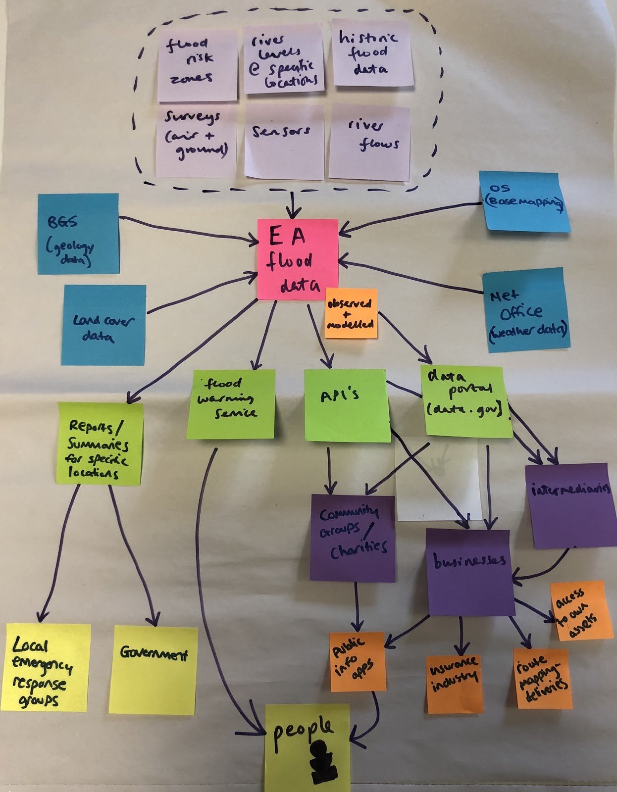
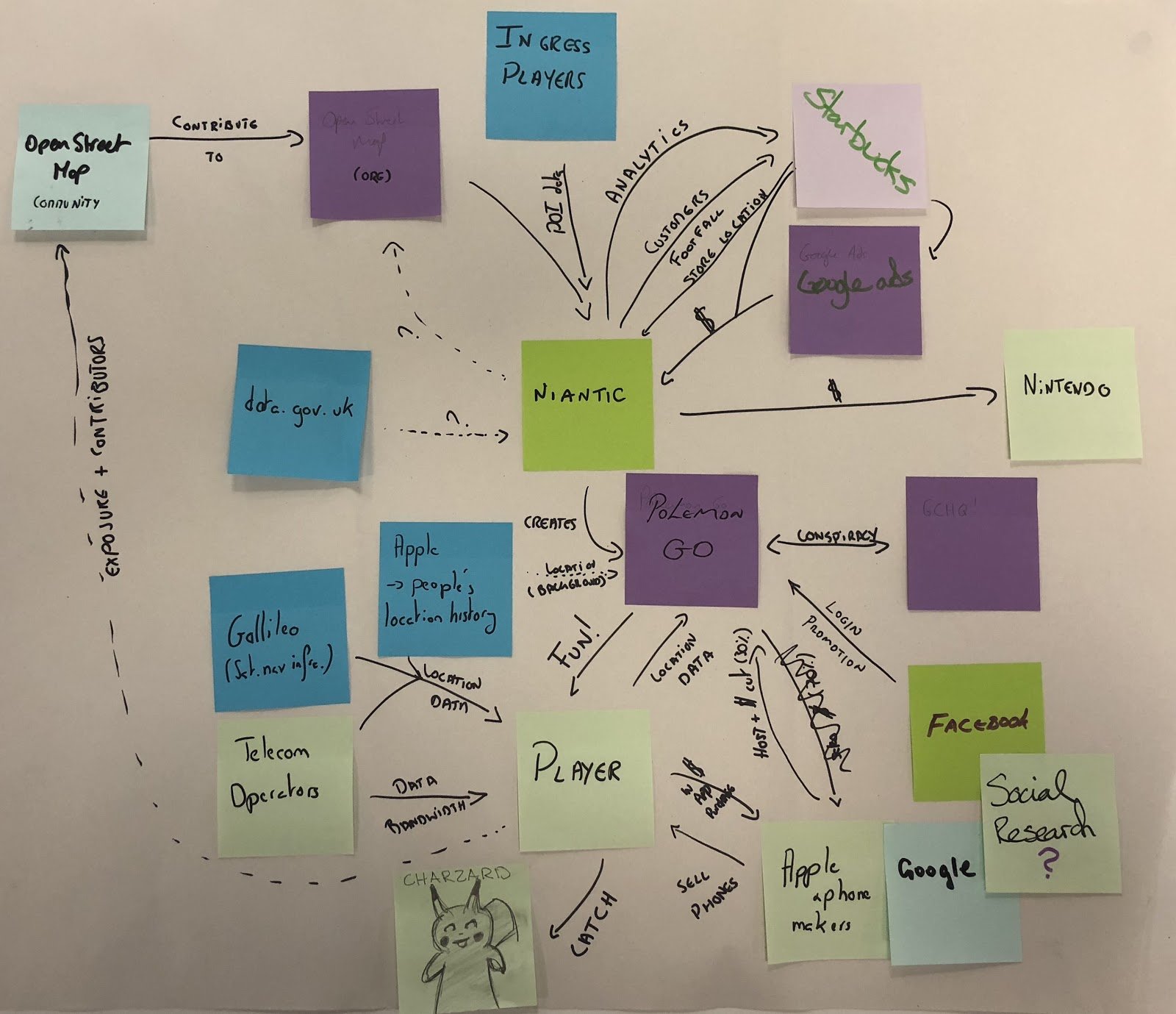
We focused on two quite different ecosystems. One was the the UK’s flood mapping ecosystem and the other was the ecosystem around Niantic’s Pokemon Go game. Here are the maps we created and some of the things that we found.
------------------
- Multidisciplinary teams created rich maps
We created the ecosystem maps by breaking into teams of around eight people. Although ecosystem mapping can be done individually, having the input from people with different skills and expertise means that more parts of the ecosystem are considered. For example, when thinking about the data flows in the ecosystems, members of our technical team contributed ideas about developer platforms and other forms of support that some data publishers provide. We also found it useful to have a facilitator to keep the groups to time and prompt them when things got stuck.
- Not all the information we needed was publicly available
To produce the maps we relied on a combination of information on the web and people’s experience of the ecosystems. Our main aim was to test using the mapping approach to think about the main actors and types of data involved, rather than draw the ecosystems out perfectly. For the flood mapping ecosystem we used a case study from an ODI report on the Environment Agency’s open data work and utilised the existing knowledge of team members. Luckily, there were also members of the team who had spent a considerable amount of time playing Pokemon Go. Despite this, there are certainly things we will have missed about both ecosystems. We’ve previously found it useful to work together on a map with key individuals or organisations in a particular data ecosystem to help navigate its complexity (such as for the Transport for London data ecosystem map above). This also confirms the need to conduct user research throughout the geospatial project to help provide detail on different topics and learn from others’ experience.
- Mapping helped us understand the different parts of the ecosystem
The mapping approach helped us to understand different parts of each ecosystem. The process identified key data stewards – those that collect, hold and share data – as well as data users, intermediaries, contributors and funders. To help us identify these key actors, we referred to the list of the types of actors (p10) found within different data ecosystems. The process also helped us to document the relationships between organisations, such as flows of data and exchanges of value. We think that surfacing these different parts of the data ecosystem helped to identify where value is created and added – such as the footfall that Pokemon Go can generate for shops, cafes and bars, or its reliance on OpenStreetMap for key data since late 2017.
- The process of mapping was as valuable as the finished maps
We found the process of mapping the data ecosystems as valuable as the completed maps. The process built a common understanding of the two ecosystems among quite a large group of people in a short space of time. We’re interested in ways that we can better share the understanding developed by taking part to others. The ecosystem mapping guide suggests creating narratives that provide context for the maps. Software like Kumu might be help to divide the maps into layers, making them easier to present to external audiences.
- It was hard to know when to stop drawing
The ecosystem mapping approach loosely follows the methodology of rich picturing. This means that drawings don’t have to follow a set structure or format, and should contain the level of detail needed to understand the ecosystem. We found that our maps became complicated quite quickly and that it was hard to know when, for example, we had documented enough types and flows of data, or the right level of detail about data users. We spent around 30 minutes on each ecosystem, which is less than the one to two hours the guide recommends, so our maps are probably not as detailed as they could be.
What next
Overall, the approach helped us to understand the two geospatial data ecosystems. We’re planning on using data ecosystem mapping in other areas of the geospatial project to support our desk and user research. As the Ordnance Survey’s OS MasterMap data becomes more openly available, we think the approach will help us to understand the ecosystem around the data in more detail and to assess the potential impacts of the planned changes.
We’ve also had feedback from other organisations like the Government Statistical Service and Swirrl who are finding the ecosystem mapping approach useful to help communicate how open data creates value and subsequently publishing their own maps.
We’ll be working in the open to share and test our thinking, and working with our members, partners and wider network to help us identify the areas where the geospatial project can have the most impact. Get in touch with us if you want to talk to us about this work, or would like to get involved.
If you’re interested in finding more about ecosystem mapping, and how the ODI can help you to apply it using the ecosystem mapping tool, please contact us.