
Guest blog by Radhita Jain and Hannah Foulds, Applied Works
If organisations want people to engage with the data they hold, and make good decisions from it, they must tell a compelling story.
At the ODI Summit 2022, we at Applied Works – an award-winning design studio – partnered with the ODI to showcase some prominent examples of where organisations and individuals have created simple and compelling data visualisations, data tools, and even physical experiences to help audiences understand complexity.
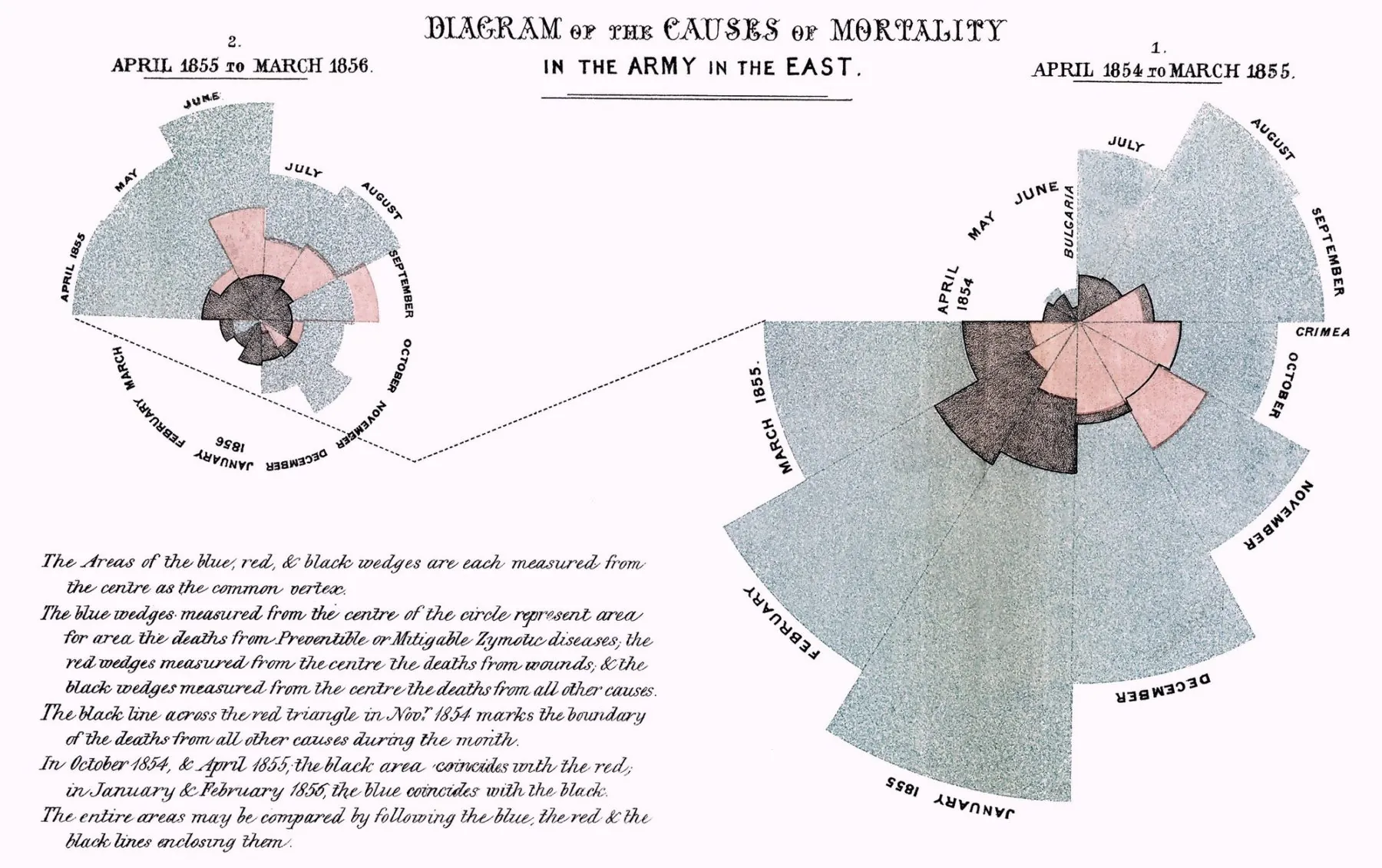
Data storytelling has been around since the Palaeolithic times, and through the ages has been used to influence human behaviour and decision making around the world. Florence Nightingale’s Diagram of Mortality from 1857 used pie charts to explain that disease was actually the biggest killer in the British Army. Physicist John Snow’s dot map from 1860 visualised cholera deaths in London to prove that the households who suffered the most were all using the same contaminated well for drinking water.
How you tell a story with data, and how you encourage people to use that data, can have a world-changing impact. It can create a shared understanding between decision-makers.
Here are the selected examples of data visualisations from the last 10 years:
Visualising a sensitive subject
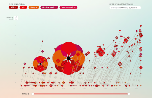
by Valentina D'Efilippo is an interactive tool that visualises the timing, involvement and death toll of individual wars fought since 1900. The intuitive design tells a simple, yet moving narrative.
‘Each individual poppy stem grows from the year when the war started, and the flowers in the year the war ended. Its size reveals the number of deaths and the variation of colour represents the areas involved
’
.
Poppies are a recognised symbol of remembrance after the First World War, worn across commonwealth countries on Remembrance Day. We selected this data visualisation for its effectiveness in tackling a sensitive subject – the visualisation adds sentiment to data without overwhelming the audience.
Using a room to explain the weight of air

by David Rickard is a physical art piece that represents the unseen weight of air. The weight of air
contained within a room is carefully measured and represented using concrete construction blocks resting on the floor.
Unlike navigating data digitally, physical data visualisations enable audiences to
share their experience in person, witness other reactions and spark conversations between viewers.
The project has been produced and displayed in Venice (Gallery Michela Rizzo), Ashbuton Art Gallery (New Zealand) and most recently in London, at the Wellcome Collection. The installation artwork communicates a complex concept through simple and recognisable visual language.
Interact with groundbreaking science
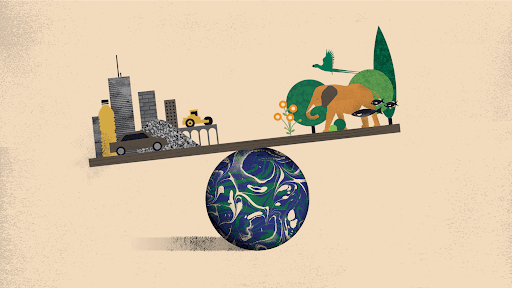
Designed by Itai Raveh, with research insights from Emily Elhacham and Ron Milo,
tells the story of how the
biomass on our planet – including humans and
our livestock – has been surpassed by
concrete, bricks, asphalt, metals, plastics, and other human-made mass
.
The interactive narrative explains the groundbreaking scientific article by Weizmann Institute of Science which concluded 2020 as the tipping point when the mass of all human-made materials grew equal to the mass of all life on our planet.
: ‘This study demonstrates just how far our global footprint has expanded beyond our ‘shoe size.’
Like an illustrated book, the visualisation uses storytelling and memorable visual cues to educate people of all ages. It illustrates complex themes and figures in clear, simple terms for a large and diverse audience.
Mapping the gender of street names
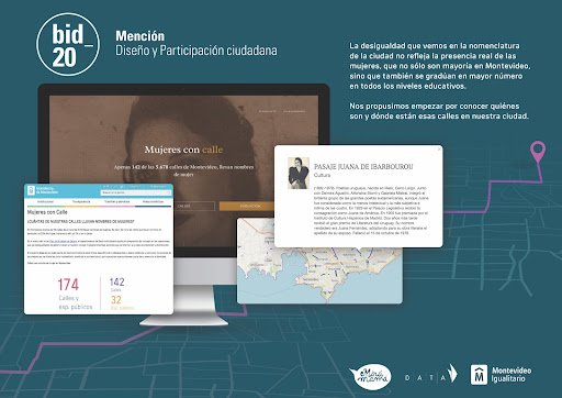
ATuNombre (tr: ’In Your Name’) is a map by DATA Uruguay that highlights the gender inequality of street names.
The project highlights systemic gender inequalities, and shows concrete examples of how they are normalised. As a result of this tool, Montevideo’s local government changed its regulation to ensure three out of every four streets are named after women, until the street name inequality disappears.
This is a wonderful example of how data and design can have a huge impact on gender equality and city planning. The tool meant that local citizens were engaged, and the city was able to lead by example, and create a fantastic roadmap for other cities to follow.
Meet the families behind the data
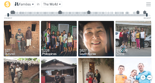
Dollar street imagines the world as a street ordered by income. Everyone lives somewhere on the street. The poorest live to the left and the richest to the right. Everyone else lives somewhere in between.
Created by Anna Rosling Rönnlund at Gapminder, Dollar Street is a photographic journal of people around the world. Users can scroll through families based on their household income and get a sense of their everyday lives.
A team of photographers documented over 264 homes in 50 countries (so far, and the list is growing). In each home the photographer spends a day taking photos of up to 135 objects – the front door, bed and even toilets. All photos are then tagged according to location, family name and income.
Dollar Street connects us with the people behind the data points. By using photos as data, the tool facilitates instant comparison together with debunking ethnic and economic stereotypes. It also highlights the homogenising impact of globalisation – similar incomes in different places around the world often have identical living situations and ways of carrying out everyday tasks.
Growth and decline of the world’s coal power plants
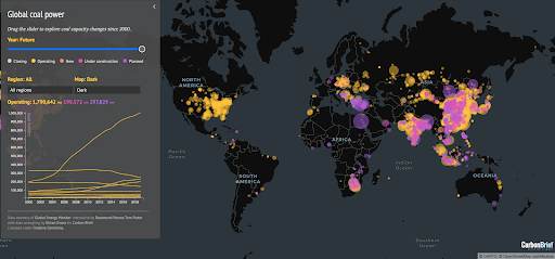
Carbon Brief has mapped every coal plant in operation between 2000 and 2020, and projects in development. This interactive map was designed to inform people of the reliance on coal energy around the world, and better understand the regions where coal plants are currently operating, under construction and where there are plans for future construction.
The map shows an eye-opening picture of coal investment shifts from the Global North to the Global South in the upcoming years. Users have flagged and amplified the issue by sharing it extensively on social media.
Aimed at policymakers, scientists, government advisors, and the general public, the criticism comes at a very pressing time in history. The map is one of the most read pages on Carbon Brief’s website.
Working with communities to record weather changes
Open-weather is a platform that investigates the politics of location that shape how we observe and respond to the climate crisis. The project crowd-sources data around the Earth’s weather systems using DIY community tools such as how-to guides, critical frameworks and public workshops on the processing of satellite images using free or inexpensive radio technologies.
Open-weather has led group workshops across Europe, and remote DIY Satellite Ground Station training sessions in Kinshasa, Seoul, the US and Australia. The majority of workshop participants were people who have historically been excluded from amateur radio spaces for reasons of skill, resource, location and language.
By gathering data from civilians experiencing the exact weather conditions that they record, open-weather challenges dominant representations of earth and environment, while exploring data democracy.
A global call to action, open-weather facilitates the connectivity we need to comprehend and fight the climate emergency.
Carve a tree, plant a forest

is an interactive platform that allows people to carve, paint and name their own tree. For every tree added to the virtual forest, Sennep, in partnership with Ecologi, plants a real Mangrove tree in Madagascar. To date, the project has enabled 10,489 mangrove trees to be planted in Madagascar.
With just a couple of settings (colour, speed, strength), the interface turns quantitative and technical values into a poetic and warm outcome. You can transform a raw wooden cone into a beautifully carved pine tree, which becomes part of a user generated virtual forest – creating a sense of community and sharing.
The beauty of this project is the transformation of data into something that feels tangible in a virtual space. By providing an engaging online experience, Pinecraft enables users to have a playful break from the day-to-day and meaningfully
spend that time supporting vital climate projects.
Simple dots portray the devastating impact of Covid-19
The New York Times’s Wall of Grief took the front page in February 2021 visualising the devastation caused by Covid-19 in the United States. In the graphic, each of the nearly 500,000 individual dots represents a life lost in just under 12 months.
Also serving as a national data obituary, the visual is a stark reminder of the immense speed at which it was all happening.
When something goes on for an extended period of time, involving a large number of people, populations can get desensitised to the effects. At a time when the shock factor of Covid-19 had subsided, the NYT’s front page brought back the overwhelming statistics that had accumulated in just under 12 months.
The visualisation of simple dots roused readers to take a moment and reflect upon the magnitude of deaths caused by the virus.